What Our New Brand Stands For
We’ve been quietly evolving behind the scenes at Pink Pine Media, and today we’re proud to introduce a fresh new look that reflects where we are – and where we’re going.
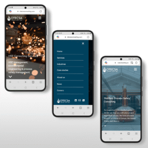
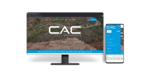
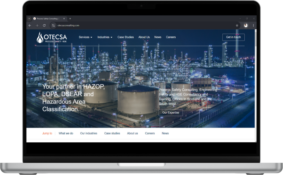
Since the very beginning, our goal has been simple: to help businesses grow with clear, creative, and results-driven digital strategy. From trades and service providers to ambitious startups and established brands, we’ve worked with clients across industries to design websites, build marketing campaigns, and bring smart ideas to life.
As we’ve grown, we felt it was time for our own Pink Pine Media rebrand to better reflect the clarity, quality, and energy we bring to every project. Our new identity does just that.
Behind the New Logo
We wanted a logo that felt clean, confident, and distinctive – but also meaningful.
The upward arrows in the mark represent growth, direction, and momentum. They reflect how we approach digital work: not just making things that look good, but creating strategies that move our clients forward.
The small dot grounds the logo – a quiet nod to staying intentional, focused, and rooted in values. And of course, the pink pine tree remains at the heart of our brand. It’s a symbol of standing out on your own terms: creative, strategic, and just a little unexpected.

What’s Ahead
This new Pink Pine Media rebrand isn’t just a visual update – it marks a new chapter for Pink Pine. We’re entering a season of growth ourselves: expanding our team, refining our services, and opening up space to work with more forward-thinking businesses across the UK.
Whether you’re a small business owner looking for a website that actually converts, a service provider who’s ready to grow your reach, or a brand who needs a creative partner to bring your next big campaign to life – we’re here for it.
We’re incredibly proud of how far Pink Pine has come, and we’re excited to share what comes next. Thanks for being part of it.
Let’s grow something great together.